Friday 30 November 2012
Photo Shoot update
The photo shoot is today at 4:15 I have prepared by checking all the equipment, I have brought in my own Cannon 550D DSLR and fish-eye attachment. I have also prepared the room and tested all the lights and equipment I will be using.
Update
I have a weeks extension until 7th December because the band was unavailable for a photo shoot as they were on tour. I have already laid out both my advert and digipack and added all the text (both seen below), the only thing missing is the photographs. I have since arranged the photo shoot with them for Tuesday 4th Decmeber at 4:15, meeting at college. I have asked them to wear dark clothes mainly blacks if possible. The shoot will take place in the media room with heavy use of lights to pick up the style I want to portray. I will also be practising with the lights and the camera on the Monday so I make sure none of the band's time is wasted trying to find the right lighting.
Friday 23 November 2012
Monday 19 November 2012
Print Work: The Concept
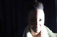
For the print work I want to use redundant elements to keep the bands star persona. But from my research, all three digipacks I looked at used more of an entropic element, with different random objects. For the front of the album cover I want to use the band standing in a line slightly staggered in a completely dark room with one light to the side of them or above or below with a rather Chiaroscuro look like the photo seem below.
In this photo, I like the fact that the eyes are completely in shadow it really detaches the the audience from the person and adds an element of mystery to the whole image.
The image on the left shows more of the rocky element head banging and screaming.
For the rest of the digipack I would like to keep the same sort of style and maybe have more extreme close ups of the eyes/mouth...
For the CD inlay tray i would like to use a fish-eye lens shot of a person sticking their tongue out as it relates to the band name 'This Wicked Tongue'
For the outside back cover a would like to have the reverse of the main cover, so you can see the back of the bands heads.
I think this whole idea will be rather redundant for the audience however the use of light and shadows will add an entropic feeling and add an element of mystery to the digipack.
Tuesday 13 November 2012
Genre Research
Foo Fighters: The Pretender
The editing is clearly motivated by the music and the sounds, this is clear use of synaesthesia, one of Goodwin's theories.
 The live performance is the only element until 1.20, and then a collection of men start gathering together in a line dressed in riot uniforms. From the highly redundant start to this video it continues on to become rather entropic, adding elements like this, which is completely unexpected.

 Close ups of the each member of the band are used throughout the video, especially the lead singer. This portrays the star persona and the image of the band. It always portrays the aggressive nature of a rock band. It also shows the audience what this band would be like to see live, and through their music video they can portray the the atmosphere and logistics of a live performance.
Later in the video paint and water is blasted into the big warehouse, as the men in riot gear charge towards the band, who are still playing. This element of chaos really adds to the music video, it is one feature that runs throughout rock videos. Also the rebelliousness of the paint, making a mess and going against the rules... All contribute to the genre characteristics of a rock music video.
Tuesday 6 November 2012
Digipack and Advert Research
Digipack Research
 I have looked at three different digipacks from the 'Foo Fighters', 'Oasis' and 'The Naked and Famous'. They all contain similar conventions to the genre of music. The 'Foo Fighters' album cover seen on the left, uses highly abstract objects that wouldn't necessarily relate directly to the audience, it portrays more of an entropic feeling. Little anchorage is used to explain why these pictures were chosen which again adds to the entropic features. Also the background is just a plain colour either white of dark brown. One feature that runs throughout all three and is usually seen twice on the digipack, once on the back and once on the inside left, is the barcode and copyright details. This is something that I must include in my digipack, this is one feature that runs through all genres of music.
With the 'Oasis' digipack the use of a fish-eye lens on the camera works well, as it is the same size as the CD contained and relates the two well. This is something I might also use in my project. Another feature that runs throughout is that none of these digipacks promote the start image of the band, only the 'Oasis' has a small picture of the band. This connotes that maybe the audience is expected to already know who the band are and what their star persona portrays. Use of colour is not one of the main conventions in the first two digipacks, however the 'Naked and Famous' digipack, seen below challenges those conventions seen above.
The outer ring uses two images that look to be at the same setting using the same angle and positioning for the photograph, but a completely different mise en scene because one is completely covered in snow. Then completely contrasting that there is the use of an inner circle, also seen in the 'Oasis' digipack. But this one contains bright colours with a kind of pop art feel to them. This album cover has many conventions of the other two but also challenges them too.
Overall I like the use of the circular theme and I like the effect of a fish-eye lens, I also like the way the last digipack challenges the original conventions with the use of bright colours. All three use a very simplistic layout they're not cluttered with lots of information, just the band name and album title. Equally the back of the cover is the same with just the list of the songs, without numbers by the side of them, copyright information and a barcode. Also the very minimal use of the star persona runs through all three. These are all conventions I believe work very well making the the CD as a whole more interesting and intriguing for the target audience.
Advert Research
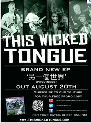
 Here is a previous advert from the band that I am using in my music video. Straight away, it clearly shows the star persona of the band, and each member showcasing they're individual instruments and styles in the four images across the top. This is something I must continue for my project, consistently portraying the distinct image of the band so they are clearly noticeable for their regular audience. The advert is sized A4, the bands name 'This Wicked Tongue' is written in the same font that is used on their other adverts and media texts. The advert is overall rather redundant it contains the album name, the release date and other information about the band's social networking sites. One feature that is really useful is the QR code, that can be scanned by any smart phone and sends you straight to their website. Also all the links to their YouTube, Twitter and Facebook are shown, this is something I believe I should also include in my magazine. The advertising of the album is just a small part of the advert because as all artists are realising now is that the main income for artists is moving away from album sales and more on to tours and live gigs, mainly because of piracy and illegal downloading.
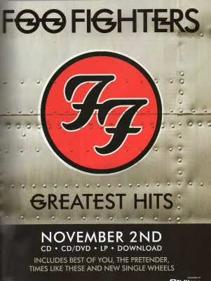
This 'Foo Fighters' advert is also A4 sized and ultimately very redundant. The use of the bands own logo (seen below) is part of the bands image and a noticeable feature for all most people who know about the band.

This advert is even more redundant than the first, the only information seen on this advert is the band name, album name, release date and a couple of the most well known songs, although that isn't much it is all that is needed for a well know, popular band. As it is advertising their 'Greatest Hits' album it is more aimed at existing fans and is less about selling the band as a whole.
Overall these two adverts have very similar qualities but also challenge the conventions in different ways. From this research I can clearly see that, how popular the band is and the money and backing they have behind them completely changes the advert. For smaller, up and coming bands it is more about getting the band name out there and not only advertising the album but the band as well. Whereas for the bigger bands and artists it is about reaching out to their existing fans and less about advertising who the band are and where to find them. So I know for my advert I will have to show the star persona and advertise the band as a whole and less about the album. However the redundant feel is used throughout, no matter how big the band is, so that is something I must also continue through to my print work.
Monday 5 November 2012
Sunday 4 November 2012
Initial Ideas
My initial ideas for the music video is to have a two main characters, one male and one female. The narrative will be to do with their struggle as a couple... interspersed with clips of the bands performance in two different locations, one a gig setting and the other in a large outdoor space. The narrative will have a happy ending and the couple will realise that there is more to life than arguing and falling out. So as well as getting the band on board I need to find two actors who would look good and be comfortable together.
Subscribe to:
Posts (Atom)


